About Me
I’m Nichole Aquino, a senior UX designer and researcher based in Los Angeles. Currently helping to improve access to federal government services at Technology Transformation Services.
Experience
Flexion Inc, 2024 – Current
Urban Design Forum, 2023 – 2024
Newsela, 2020 – 2023
General Assembly, 2018 – 2020
Ironpaper, 2015 – 2017
Past Partners
General Services Administration
U.S. Department of Justice
NYC Public Schools
Brooklyn Public Library
NYC Dept. of Health and Mental Hygiene
Forms Platform: Making Government Forms More Accessible
-
Role: UX Researcher and Design Strategist
Organization: 10x in partnership with U.S. Department of Justice
Timeline: 7 months
Team Size: 7
About
My team is creating a no-code form-builder to address 21C IDEA, which mandates that government forms be built as web applications. As lead designer, I am responsible for creating a great experience for users creating forms and for users completing forms. I entered this project in the delivery phase, building off of existing designs and development. Our goal is to deliver an MVP to our pilot partner at the Department of Justice (DOJ) Office of the Pardon Attorney.
Background
As of 2024, fillable PDFs are no longer compliant as public-facing digital forms. However, most agencies don’t have resources to build compliant digital versions of all of their forms. There are also few choices in the market that are compliant for use with Federal data. As a solution, the 10x Forms Platform helps agencies deliver a great digital experience that works for all users on all devices.
Deliverables and Impact
To ensure a great user experience and alignment with U.S. Web Design System, I conducted a design audit of the existing components in the platform (e.g. short answer, long answer, multiple choice, checkbox, rich text). As a result of this audit, I improved the UI of all 17 components for two views – for the form-builder and form-filler. Additionally, I detailed validation error messages to guide form-fillers, and redesigned the ‘Add element‘ menu to lift usability.
In addition to improving existing components, I designed new capabilities such as multiple entries and logic to meet MVP requirements. This involved:
Leveraging insights from past research
Conducting a UX teardown of similar platforms in the industry (e.g. Suffolk County Forms, GC Forms) and form builders (e.g. Google Forms, Typeform)
Conducting user testing on new concepts with DOJ partners and legal aides
Observing best practice guidelines from government design systems (e.g. U.S. Web Design System, VA.gov Design System, GOV.UK, GC Forms)

Caption
UX/UI Design and Research (2025)

Caption

Caption

Caption
Zine Archive: Designing Teen-Centered Libraries
UX Design & Research, Spatial Design (2024)
-
Role: UX Design Lead
Organization: Urban Design Forum with Brooklyn Public Library
Timeline: 5 months
Team Size: 5
About As part of Urban Design Forum’s Forefront Fellowship, I worked with community organizers, educators, urban designers, and youth to envision teen-centered library spaces in NYC. We hosted a discovery workshops, and as UX Design Lead, I led the product strategy and development of a zine archive and co-developed design guidelines.
Background
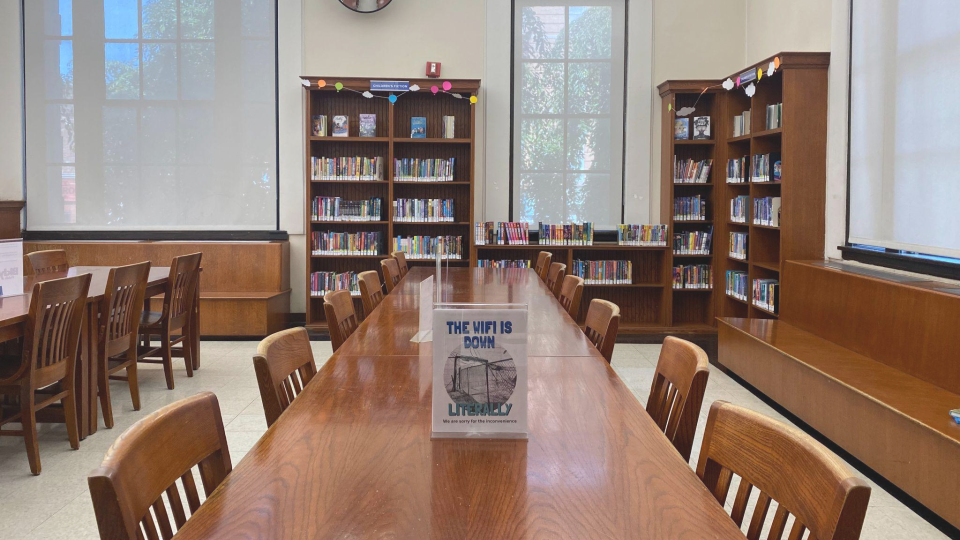
Youth envision libraries as a space to learn and grow – a place to feel free. But libraries in NYC fall short of this vision. Its state of disrepair, disinvestment, and decay leads to low teen engagement across branches. Teen spaces often aren't created with teens at the helm. They may come across as surveilling, disengaging, or at times hostile to youth. Our goal was to build teens’ civic capacity to co-create their libraries of the future.
Deliverables and Impact
An Arts-Based Curriculum: Using zine-making as a research modality, our open source curriculum instigates a creative dialogue with teens about their experiences and dreams for a future library. Additional workshops will be piloted in Brooklyn Public Library branches in Summer 2024.
An Open-Source Zine Archive: The archive is an online collection of zines and themes for a teen-centered library. Our product – and process of turning art into data – has piqued interest from Department of Education and library advocacy projects like For the People, founded by Mariame Kaba.
Youth-led Design Guidelines: The guidelines are nine ways to create safe, supportive library spaces for youth. They honor the perspectives and voices of youth, drawing on key themes identified in our workshops. The guidelines are available in paper form as large and mini posters.
Deep Dive: Zine Archive
Participants donated 60 zines to our project. We had asked them to envision what a teen-centered library looks like. The zine archive is a collection of their visions.
To turn art into data, I used Airtable to catalog and analyze themes in the zines. For example, the zine titled “We Want More” mentions things like chill zones, cozy chairs for different types of thinkers, and bringing a library to a community where there is none. So I coded it as: comfy seating, loud/quiet zones, accessibility, and food/drinks. I analyzed all zines in this way, highlighting important qualities in a teen-centered library.
▶ A clip of me describing the zine archive at the Forefront Fellowship Capstone, 2024
Deep Dive: Design Guidelines
After surfacing the themes, l co-developed nine design guidelines for a teen-centered library. I also designed large and foldout posters, using illustrations by Ping Zhu.
Let the outside in: Stimulate the senses with biophilic design and sounds for the soul.
Let the inside out: Expand knowledge beyond walls and bring the library outdoors.
Make it cozy: Create cozy, welcoming spaces for teens to feel at home.
Make it accessible: Expand dimensions around accessibility for all library users.
Let them be loud: Support solo and group activities to let teens’ voices be heard.
Let them eat: Serve study snacks with affordable, healthy food and beverage options.
Modernize resources: Promote learning beyond the classroom with up-to-date literary collections and resources.
Provide relevant programming: Activate library spaces with paid work and learning opportunities and teen-led programming.
Build a coalition of libraries: Build a coalition among indie, mobile, and public library systems in your neighborhood.
Libraries today come across as surveilling, disengaging, or at times hostile to youth. Through workshops, teens explored how libraries could better meet their needs.
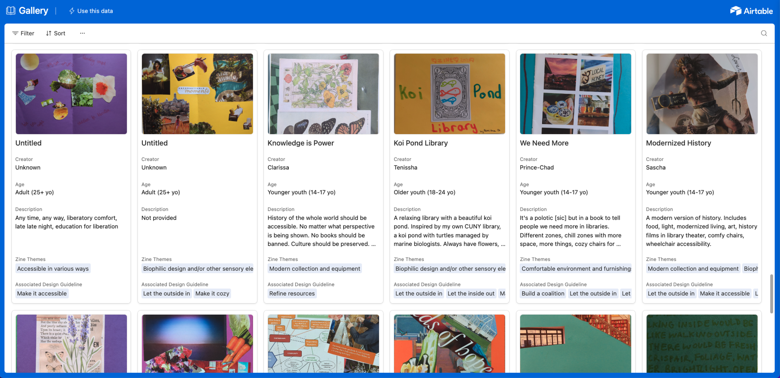
Teens created zines to envision a teen-centered library. To organize these ideas, I created a zine archive, which is accessible across all devices on Airtable.

I led the analysis process, extracting common themes found across the zines. In this example, one teen imagines a library with loud zones and comfy seats.
Assignment Builder: Streamlining Teacher Workflows
UX Research (2023)
-
Role: Sr. UX Researcher
Organization: Newsela
Timeline: 2 months
Team Size: 4
About
Ahead of back-to-school, Newsela rolled out new features in a split A/B test to give teachers more control when creating assignments. Working with Product Managers and a Data Analyst, I led user interviews to assess the value of these new features. My insights shed light onto what (and why) certain features were performing well, helping our team prioritize what to refine and deploy in a full-scale release.
Background
From past user research, data, and customer feedback, we knew that teachers were missing key assignment features and were using off-platform workarounds to meet their needs. So, the product team prototyped a set of new features (e.g. ability to lock reading levels, set start/due dates, assign specific activities). We wanted to see which features brought the most value to users, and consequently, the most value to the company.
Process
In building the test plan, I defined the test objective, research questions, participants, methods, and schedule. Since features were released to the experiment group on a biweekly basis, I designed a testing schedule to reflect this cadence and to work in lock-step with my product counterparts. This process looked like:
Product Managers and Data Analyst reviewed analytics to identify areas for inquiry.
I conducted interviews based on the feature release schedule.
I led weekly meetings to review quant and qual findings, adapt interview questions as needed, and address any critical action items.
Deliverables and Impact
Bi-Weekly 1-Pager: This brief summary, released bi-weekly as new features were prototyped and tested, kept stakeholders engaged and agile throughout the process. It included an average rating usability and usefulness for each feature. It also highlighted what was (and wasn’t) working well with actionable recommendations. Through these regular updates, my team was able to prioritize what features to refine, and also fix some critical bugs before deployment.
Final Summary: After all features had been tested, I produced a final summary outlining the takeaways from each feature, as well as short- and long-term recommendations. The learnings from this study provided the validation needed to roll out critical features for Back-to-School. As hypothesized, teachers were making assignments on the platform more than before given their new set of features.
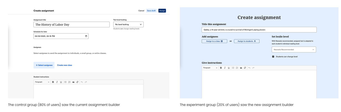
The control group (80% of users) saw the current assignment builder. The experiment group (20% of users) saw the new assignment builder.

A teacher explaining the value of the new ‘lock lexile‘ feature to her workflow.
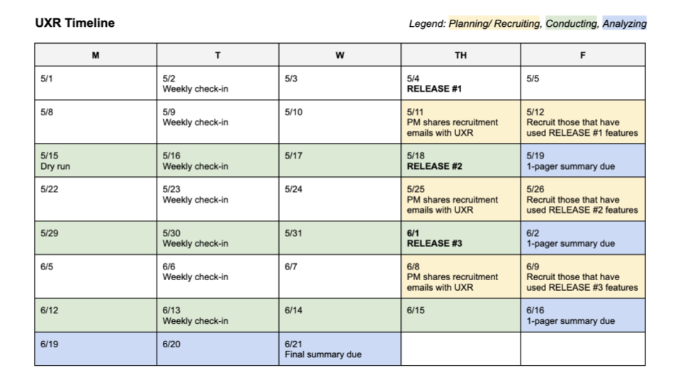
My UXR timeline, which weaves in user testing and check-ins over the course of two months.
Image in device
Generation NYC: Connecting Teens to City Resources
UX Research (2018)
-
Role: Service Design Fellow
Organization: Mayor’s Office of Economic Opportunity with The Administration for Children's Services (ACS)
Timeline: 1 month
Team Size: 8
About
I helped improve the user experience for Generation NYC, produced by the Mayor’s Office for Economic Opportunity to provide information relevant to NYC teens and young adults. Specifically, I led a discovery workshop with the Youth Leadership Council (of ACS). Collaborators included team members from the product, content, and service design teams.
Background
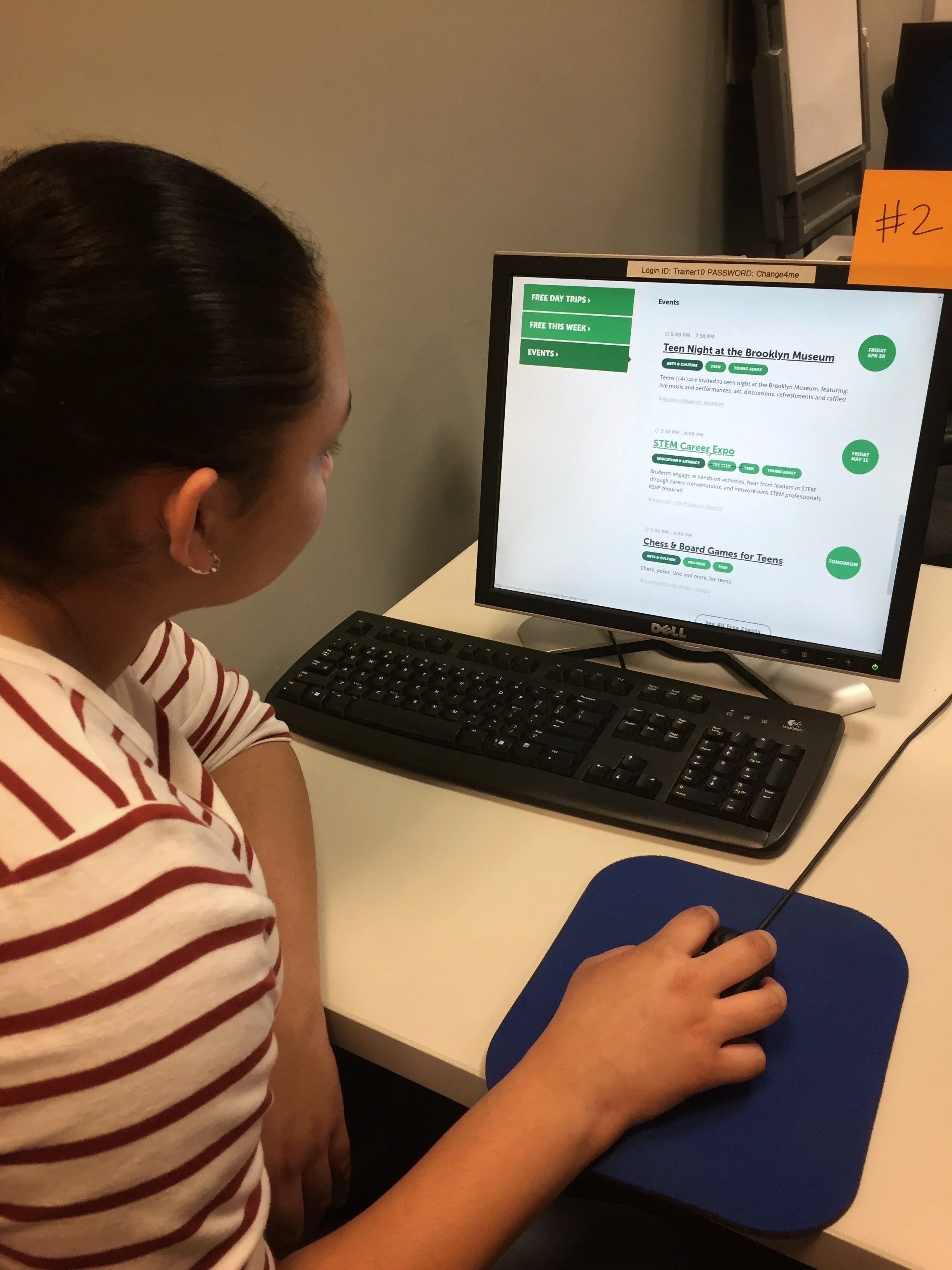
Generation NYC provides a wealth of information on housing, finances, education, and other helpful topics for growing up in NYC. But product data and user feedback indicated a need to improve its usability and relevance. We needed to evaluate the site’s navigation, page layout, as well as explore new content and features relevant to young New Yorkers.
Process
My workshop involved 1) evaluative research to assess the current site, and 2) brainstorming to envision a better one. For the usability test, we collected time-on-task, successful task completion, and qualitative insights. For the brainstorm, we used a card sort to understand most valued topics. While participants found the site clear and helpful overall, they suggested ways to improve engagement such as highlighting the texting feature, using catchy headlines, and providing resources for life skills and mental health.
Deliverables and Impact
My insights and recommendations helped inform the roadmap for both the product and content teams. My workshop also shaped the team’s user testing protocol, incorporating small group work for collaboration and creative problem solving.

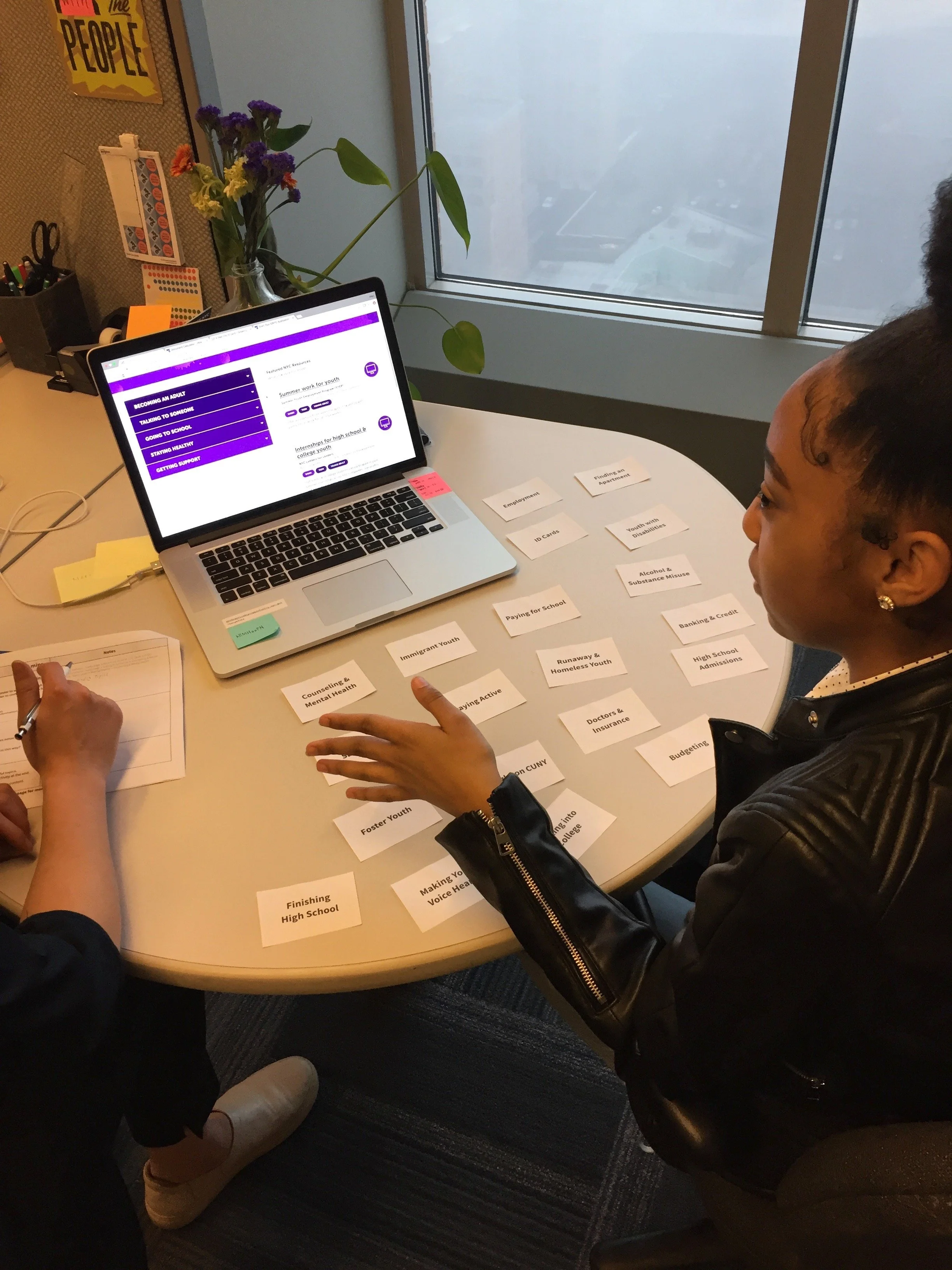
I led a workshop with 15 teens and 8 team members. Activities involved assessing the current site and brainstorming content and features relevant to NYC teens.

Participants suggested ways to improve engagement such as highlighting the texting feature, using catchy headlines, and providing mental health resources.
My insights and recommendations helped inform the roadmap for both the product and content teams. My workshop also shaped the team’s user testing protocol.
Generation NYC is a website designed for NYC teens. The product team aimed to improve engagement by improving the usability and content of the site.
Course Catalog: Helping Students Advance their Careers
UX Design and Research (2020)
-
Role: Sr. UX Designer
Organization: General Assembly
Timeline: 3 months
Team Size: 6
About
As part of the product team at General Assembly, I helped improve the experience of discovering workshops, bootcamps, and events for 1M+ learners worldwide. I led the UX/UI and user research for the new course catalog. Collaborators included a Product Manager, UX Writer, Product Marketing Manager, Engineer, and Admissions Producers.
Background
General Assembly boasts a robust roster of in-demand courses in coding, data, and design. But the course catalog was confusing for prospective students – it was difficult to browse and unclear how the options differed. This poor user experience led to a high bounce rate and lost revenue for the business. We needed to improve product discoverability and understanding in the new course catalog.
Process
My design process involved creative problem solving, timely user feedback, and a healthy amount of stakeholder engagement. This included:
Discovery User Research: This included stakeholder interviews, listening to admissions calls, and heat map analysis to understand business needs and user pain points.
Design Ideation: This involved competitive research and a workshop with a cross-disciplinary team to engage stakeholders early in the process.
Wireframes: I created and tested wireframes to assess how well the concepts met user and business needs.
Mockups & User Testing: I made and tested prototypes, continuously refining the product taxonomy and layout based on research, stakeholder feedback, and best design practices.
Product Language Testing
As part of my testing plan, I assessed product taxonomy and language with a closed card sort and a cloze test. The objective of these tests were to learn what words or phrases were the most or least clear, and to see if the product categories were clear and distinct overall. Not only did the tests clarify the product taxonomy and language on the page, but they also informed the product marketing messaging across the brand.
Deliverables and Impact
The revamped course catalog helped prospective students find and understand their options. The improved UX boosted full-time leads by 16% and part-time leads by 8% for a 10% lift in revenue (~$400k a month). Specifically:
The new catalog reduced users’ overwhelm and drove greater understanding with an updated look and feel, and clear product categories and details
Users could easily find what they were looking for with a revamped filtering system, allowing them to browse by topic, location, or schedule
I led the design process to improve product discoverability and understanding of the new catalog. I parntered with UX and product marketing.
As part of my research process, I assessed product taxonomy and language. Insights from this activity revealed the most clear, distinct product names and categories.
The revamped course catalog helped prospective students find and understand their options. Full-time leads increased 16% for a 10% lift in revenue.
General Assembly’s course catalog was confusing for prospective students. This poor user experience led to a high bounce rate and lost revenue for the business.